image via Tiffany.com
Well-designed packaging is an integral part of a product's sales strategy and can be a major contributor to its success. This is well known by the marketing experts of today's large and small companies, who spend vast resources on surveys and research before selecting the right packaging for their new products. But "the dress," if we want to call it that, has always been an important element in effectively representing a brand, and in some cases, it has been so spot-on that it became more iconic than the brand itself.
The most successful strategy in the past has been the simplest: one color or, at most, a combination of two colors designed to go down in history and survive decades of change. We're sure you've already some many examples in mind, we picked the orange and brown duo chosen by the French Maison Hermès, a lasting match that was born almost by chance. In the beginning, Hermès products were packaged in cream boxes, but in 1942, when Paris was occupied by the Nazis, supplies of boxes began to run low and the patron of the Hermès boutique, Emile-Maurice Hermès, which had already been operating for 105 years, was left with the boxes that no one wanted: the orange ones. Without resigning himself, Emile-Maurice wrapped those boxes with a brown ribbon printed with his logo, and this is how the current Hermès packaging was born.
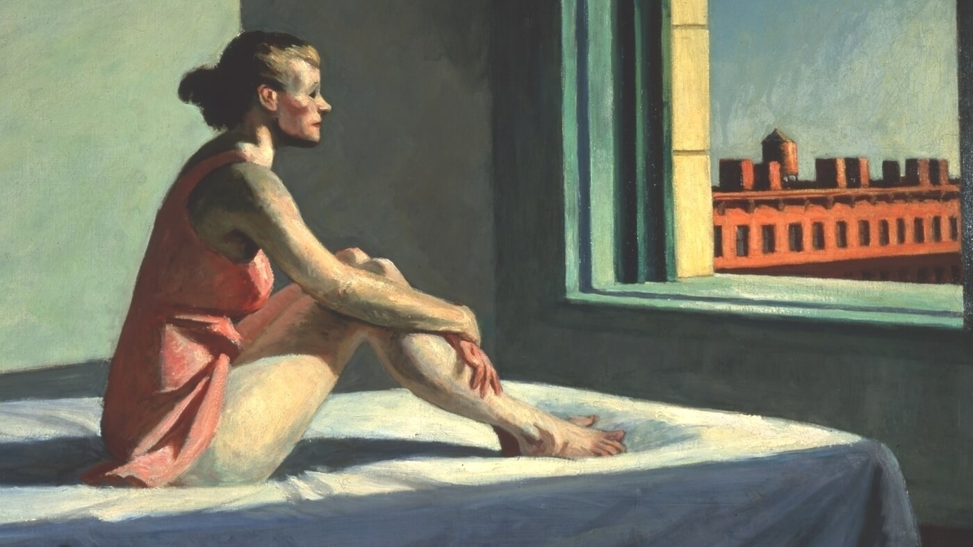
Another iconic color remains Pantone “1837 Blue”, or the unmistakable Turquoise chosen by Charles Lewis Tiffany to package the precious items sold by his boutique. Since the early 1900s, turquoise boxes have been considered by Tiffany&co just as precious as their contents, and the company has forbidden their release except with the purchase of one or more of the brand's jewels. And there is no doubt that this mix of 3.9% red, 72.9% green and 71% blue has been one of the most recognizable colors globally for more than a century. Appreciated by celebrities and regular customers alike, the color has received many tributes in the years. The latest is the video resulting from the collaboration between Tiffany&co and Jay-Z and Beyoncé in which Equals Pi, the painting that Basquiat realized in 1982 on a Tiffany blue background, is featured prominently (in the picture above).
And surely any shape plays its part in the success of a product. One example among all is the Campari soda bottle designed by the great futurist artist Fortunato Depero to contain the first aperitif preparation in Italy in 1932. The inspiration is taken from the advertising posters that the artist had dedicated to Campari in previous years, but the real intuition was to use a cylindrical frosted glass bottle similar to an upside-down goblet capped by a small crown cap for ready use. A small project made between art and design for what could have been a simple wrapper, but which was a real revolution for the way of consuming a disposable product in bars all over Italy and the world.
Cheers to good design, even that of packaging!


.png)
