


.png)
Pantone's "Color of the Year", COTY, turns 20 years old and is by far the most celebrated competition in the world dedicated to colors. But it is only in the last decade that this award has achieved its worldwide fame, shaping the course of furniture, fashion and cosmetics trends. We all know that colors have a strong influence on our mood, our environment and the products we are buying, but what does the rainbow formed by the COTY in the last 10 years tell us?
Let's start from 2010 with Turquoise, a color recalling Caribbean waters and tropical landscapes. It is a calming nuance which became blurrer in that spring with the eruption of the Icelandic volcano Eyjafjallajökull which made the sky became cerulean - almost by chance 10 years earlier the first ever Pantone COTY was Cerulean. Glass, velvets and patterned fabrics brought turquoise to every room of the house, satisfying the need to escape of millions of citizens unable to travel in that year.
The palette chosen by Pantone for the next two years continues on the line of brilliant colors stimulated by the desire for optimism started the previous year. The colour of 2011 is Honeysuckle, a pink that points towards red and captures the extremes of the colour of the millennium. And Tangerine Tango orange with its ruby character reminiscent of the sun setting after a bright summer day.
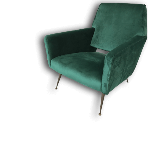
More balanced is the tone of green chosen by Pantone in 2013, color Emerald, which we see reccurring on the walls of the most glamorous houses together with the violet named the best color of the following year, Radiant Orchid. Both these colors bring our minds back to earthy concepts, plants and the desire to include the outdoor environment in our home.
Following the green wave, in 2015 Pantone promotes a color that recalls the intense and full-bodied flavor of aged wine and gives furniture and walls a feeling of warmth and comfort. Color Marsala invades living rooms and can be found in carpets, cushions and upholstery blending harmoniously with wooden furniture and neutral surroundings.
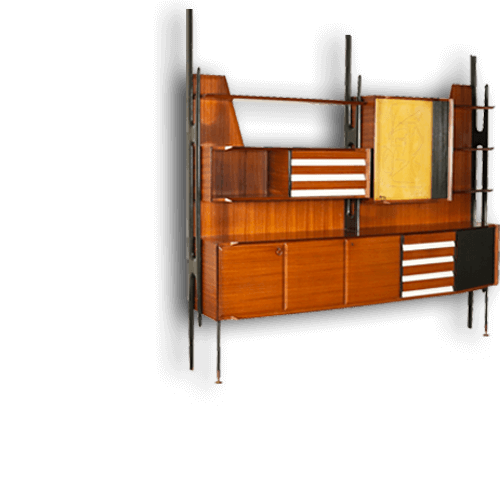
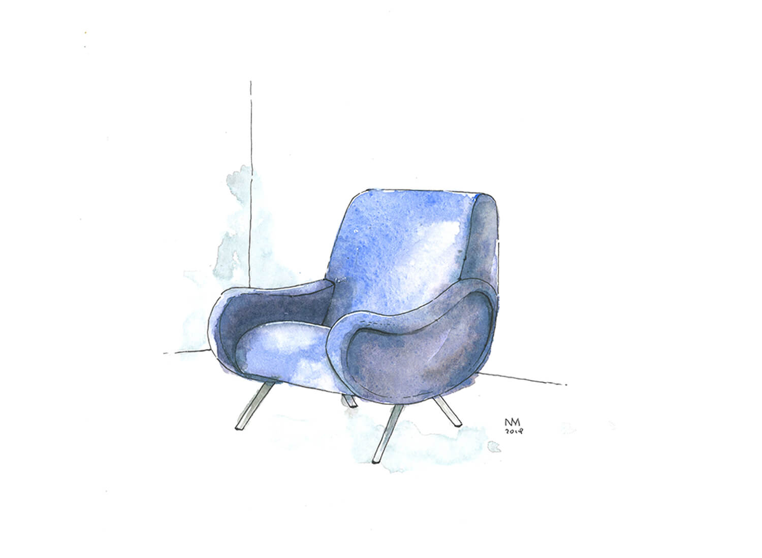
2016 is an extraordinary year: two Popes and two Pantone colors! Two delicate tones share the nomination of color of the year, Rose Quarze and Blue Serenity. In the first case it is a color that will achieve worldwide success through companies such as Apple, which for the first time dyes its canonically white appliances, and brands such as Nike committed in promoting "pink" sports. A winner tone that is not a new entrance and can be found especially in vintage furniture from the 1910s.
The coexistence between man and nature is crucial for Pantone for 2017's color, Greenery, a calm green that can be found in every detail of the organic world. But the spectrum widens more and more in the following years, moving between a dramatic purple, 2018 Ultra Violet, and Living Coral, a statement red chosen for 2019. And then, unespectedly, we went back to tradition with the 2020 color of the year, which is a must of all time, Classic Blue. The decade thus ends with a color that is an invitation for meditation and reflection on the future, a color that makes us feel like when the sun goes down, letting the intense blue of the sky dominate our spirit.
