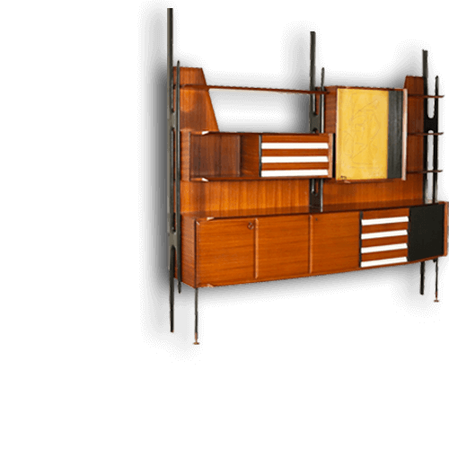


.png)

What do you feel when you are in a dark room? Does the color blue make you feel calm or relaxed? Through the years of design and architecture, artists and designers have long believed that color can dramatically affect moods, feelings, and emotions. "Colours, like features, follow the changes of the emotions," the artist Pablo Picasso once remarked.
In 2019 the concept of color psychology has become a popular topic in art, design, and especially in marketing area. Colours simulate actions in human brain and this creates a direct response, we may address it as a call to action. This is why color is a really powerful communication tool and can be used to signal action, influence mood, and even influence physiological reactions. Certain colours can even be connected with increased blood pressure, metabolism and eyestrain.
Here is a great example of how color has been used in a specific and attention seeking field like health, The Paimio Sanatorium in Finland design by famous architect Alvar Aalto in 1929. Most of us know the famous “Paimio Chair” which was specifically designed to create a perfect angle to open up the lungs of the patients and make it easier for them to breathe. But the chair is just a piece of a highly functioning system.
The most eye catching feature of the hospital’s architecture is the colour coordination in the interiors of the building. We can see that Aalto paid attention to every detail. According to the functional principle, the entire building had to be one healing element. In order to achieve that principle of functionalism, Aalto designed each part of the building using a different colour. The staircase and floor of the lobby was designed bright yellow to give energy and reflect most of the sunlight. The story goes that Aalto had regrets about the shade, but the floor materials had already been ordered and they were installed as such.
Artist Eino Kauria took part in the color planning for the sanatorium with Aalto. In Aalto’s notes he also wrote about the colours used in the patient rooms: “The walls are light and the ceilings darker. This makes the general tone more peaceful from the perspective of a lying-down patient. The general lighting point of the room is above the patient’s head at the interface of the wall and ceiling, which means that it is outside the angle of vision of a lying-down patient.” It was hoped that the colours coordination would soothe the patients and it clearly worked.
